
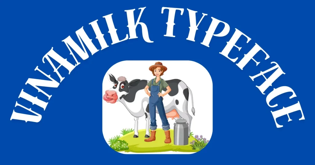
Introduction to Vinamilk and their rebranding strategy
Vinamilk, Vietnam’s leading dairy brand, has recently embarked on an exciting journey of rebranding. This bold move demonstrates their commitment to staying relevant in a rapidly changing market. With the introduction of the Vinamilk typeface, they aim to reshape not just their visual identity but also how consumers perceive and connect with them.
A strong brand image is crucial for any company aiming for longevity and success. It serves as a bridge between the business and its customers, fostering loyalty and recognition. As Vinamilk takes this significant step forward, it opens up discussions about the critical role typography plays in branding strategies today.
Let’s explore how the evolution of the Vinamilk typeface symbolizes more than just aesthetic changes—it’s a powerful tool that reflects the company’s core values and aspirations while resonating with both new and loyal customers alike.
The importance of a strong brand image
A strong brand image is crucial in today’s competitive marketplace. It shapes how consumers perceive a company and its products. With countless options available, a memorable brand helps businesses stand out.
Brand image fosters trust and loyalty among customers. When people recognize a logo or typeface, they often associate it with quality and reliability. This connection encourages repeat purchases.
Moreover, an effective brand can attract new audiences. A consistent visual identity communicates professionalism and stability. This consistency nurtures consumer confidence.
In essence, investing in brand image pays off significantly over time. Companies that prioritize their branding tend to achieve higher visibility and engagement rates across various channels.
The evolution of the Vinamilk typeface
The Vinamilk typeface has undergone a remarkable transformation. Initially, it featured conventional designs that lacked uniqueness. As the brand evolved, there was a clear need for something fresh and distinctive.
The new typeface embraces modernity while honoring tradition. Its sleek lines and bold curves reflect both confidence and approachability. This balance resonates deeply with today’s consumers who value authenticity.
Each character was thoughtfully crafted to convey clarity and warmth. The meticulous attention to detail ensures that every letter feels inviting yet professional.
This evolution is not just about aesthetics; it represents Vinamilk’s commitment to innovation in the dairy industry. By adopting this contemporary design, they have set themselves apart from competitors.
The refined typography enhances brand visibility across various platforms, making it instantly recognizable in crowded marketplaces.
The inspiration behind the new typeface design
The new Vinamilk typeface draws inspiration from Vietnam’s rich cultural heritage. Designers looked to traditional patterns and motifs found in local crafts. This connection brings a sense of authenticity to the brand.
Nature also played a significant role in shaping the typeface. The curves and lines mimic the gentle flow of rivers and lush landscapes that define the country. Each letter reflects harmony, echoing Vinamilk’s commitment to quality.
Moreover, modernity was embraced in this design journey. A balance between contemporary aesthetics and cultural roots creates a unique visual identity. The result is both fresh and familiar, appealing to diverse audiences.
This thoughtful approach makes the typography not just functional but expressive as well. It tells a story—one of tradition meeting innovation, resonating deeply with consumers who value heritage while looking toward the future.
Impact on consumer perception and brand recognition
The introduction of the Vinamilk typeface has significantly shifted consumer perception. As a bold and fresh design, it stands out in a crowded market. This visual change captures attention, inviting consumers to take a closer look.
Brand recognition benefits from such transformation as well. A new typeface can make products feel more modern and relevant, enhancing their appeal. When customers see that distinctive font on packaging or advertising, it resonates with them.
Moreover, the uniqueness of the Vinamilk typeface fosters familiarity over time. Consumers begin associating positive experiences with its aesthetic appeal. This connection boosts loyalty and encourages repeat purchases.
Additionally, the sleek design aligns with contemporary trends in branding. It positions Vinamilk not just as a dairy company but as an innovator within the industry. Such strategic moves are essential for long-term growth and success amid changing consumer preferences.
Feedback from consumers and industry experts
The response to the new Vinamilk typeface has been largely positive. Consumers have expressed excitement about the fresh look and modern feel it brings to the brand. Many appreciate how it reflects a commitment to quality.
Industry experts have also weighed in, noting that this bold move aligns with global branding trends. They see it as an effective way for Vinamilk to stand out in a competitive market.
Some designers highlight the readability and versatility of the typeface across various media platforms. This adaptability is crucial in today’s digital age where visual consistency is key.
There are suggestions too, regarding further enhancements but overall feedback remains encouraging. The new font seems poised to strengthen engagement and foster loyalty among both existing customers and potential ones alike.
Conclusion: A successful rebranding for Vinamilk
Vinamilk has embarked on a remarkable journey of transformation with its new typeface. This bold step in brand repositioning not only enhances their visual identity but also aligns perfectly with the company’s mission to provide quality dairy products. The thoughtfulness behind the design reflects Vinamilk’s commitment to innovation and consumer engagement.
As consumers resonate more with brands that exhibit authenticity, this new typeface can strengthen emotional connections. Feedback from customers and industry experts highlights a positive shift in perception, reinforcing Vinamilk’s status as a leader in the dairy sector.
The evolution of the Vinamilk typeface is not just an aesthetic upgrade; it symbolizes growth and adaptability in an ever-changing market landscape. As they continue to embrace modernity while honoring their roots, Vinamilk sets itself apart as a forward-thinking brand ready for future challenges.
Embracing change can be daunting, but for Vinamilk, this strategic rebranding appears to be a resounding success that promises sustained recognition and loyalty among consumers.
FAQs
What is “Vinamilk Typeface”?
The “Vinamilk Typeface” is a newly designed font introduced by Vietnam’s leading dairy brand, Vinamilk, as part of their rebranding strategy. It combines modernity with cultural heritage, enhancing the brand’s visual identity and recognition.
Why did Vinamilk rebrand its typeface?
Vinamilk rebranded its typeface to stay relevant in a competitive market and to establish a stronger, more distinctive visual identity that resonates with both new and loyal customers.
How does the Vinamilk typeface reflect the brand’s values?
The typeface symbolizes Vinamilk’s commitment to innovation, quality, and tradition. Its modern design integrates elements of Vietnam’s cultural heritage, aligning with the brand’s dedication to authenticity and progress.
What impact has the new Vinamilk typeface had on consumers?
Consumers have reacted positively to the new typeface, appreciating its fresh, modern look. It has enhanced brand recognition and strengthened emotional connections, fostering loyalty among customers.
How does the Vinamilk typeface align with global branding trends?
The Vinamilk typeface follows global design trends by focusing on readability, versatility, and a strong visual identity. This strategic move helps Vinamilk stand out in a competitive market and appeal to diverse audiences.